Wednesday, January 30, 2013

Arteries of the city


I created this graphic back in October shortly after Hong Kong's Transport Department released their annual traffic census. The 182-page report was packed with statistics and useful information but the best data was a thorough breakdown of daily traffic on almost every stretch of road. The territory has hundreds of counting stations. We thought the chance to do something with these numbers was too good to miss so we pitched an analysis to the Editor who was keen to give it a good space.


The thickness of each line represents the average daily number of vehicles traveling on that stretch of road. The colour represents the percentage change on last year. This helps the reader to explore the data in two ways. You can clearly see that the main roads along the front of Hong Kong Island are still the busiest. But by the colour, the traffic has also mostly decreased compared to last year. You can also see that a lot of the roads in Kowloon have become busier. In particular the area up to the left, Tsuen Wan, the three tunnels north and the major highways to the east.

There is also a clear change in the cross-harbour tunnels. The Eastern and Western Harbour Tunnels have increased in traffic compared to the central tunnel which has decreased. But they still see less traffic.

The graphic is also a fun way for the reader to take a look around their neighbourhood or route to work.


Friday, January 18, 2013


Roadside pollution in Hong Kong hit a record high this year, on August 2 in Central, with the index reaching 212. As the year drew to a close, we took a look at how the air had fared in every hour in the year up to the publishing date.


Each day is represented by a row of 24 squares, one for each hour of the day. The shade of the square indicates the pollution reading at Central monitoring station.


The idea was to give the reader an overall glance at the year so they can see the worst and clearer periods, but also the opportunity to dig a little deeper into the hourly data. We also added some text pointers to explain some probable contributing factors to clearer air such as typhoons.


Hong Kong’s air pollution is often blamed on its proximity to mainland China’s industry. Wind direction each day is included as small arrows to the left of each row in order to gauge, if any, the relationship between northerly winds and bad air.


We wanted the reader to come to their own conclusion about the relationship with wind direction but it turns out a lot of the bad spells coincide with winds from the North (black arrows). See below.


The graphic was published as a full broadsheet back page near the end of December.


Thursday, December 13, 2012

Messi v Muller

We published this information graphic when Lionel Messi broke Gerhard Muller's record of 85 goals in a calendar year. 


The chart shows every goal, plotted by date scored. The length of a bar represents the number of goals scored in that day’s match. 


We wanted to do more than simply compare the number of goals each player has scored. Presenting every goal on a timeline in this way allows us to study the data and draw our own conclusions as to which of the two goalscorer's records in most impressive. It lets us see busy scoring periods, drier seasons, big hauls in some games (often scoring 4 or 5 goals) and most importantly, how Muller continued his prolific scoring rate for many years after he set the record in 1972.


The data for Messi's goals and when he scored them was pretty easy to find from various reliable websites. Muller's was not so easy. So much so we had to commission a private sports data company in Germany to compile it for us. In the end we decided it was worth the extra expense in order to show the information this way and give the reader a different angle to other Messi infographics they may have seen recently.

Sunday, December 2, 2012

As the government considers a revamp of electricity tariffs, we took a look at Hong Kong's power consumption. Who uses all the electricity in our city and what is it used on? This graphic was printed last week as a full broadsheet back page. Data set was provided by the government's Electrical and Mechanical Services Department.


This type of chart is known as a Sankey diagram. The thickness of each line reflects a value. In this case, an amount of electricity in terajoules. All of the lines add up to give subtotals and totals by users (grey) and end use (coloured).


Friday, November 23, 2012

Wages in Hong Kong

As Hong Kong’s wealth gap widens, who is on which side of the growing divide? This graphic shows which industries pay the most and which have the biggest discrepancies between their highest and lowest earners. The dataset was provided by the Hong Kong Census and Statistics Department and covers all official employment in HK. This graphic was printed as a full broadsheet page.


Each industry is represented by a series of 3 connected dots. The middle dot is the median wage for that sector and the top and bottom dots are the averages for high and low earners (90th and 10th percentile). This shows some industries have a huge difference between top earners and what most others are paid.


The height of the dots reflects the hourly wage in HK$. The industry, or green line/dots, is also placed left to right along the x axis according to how many people work in that industry. You can see Import and Export Trade alone out to the right of the chart. By far the biggest employment sector in Hong Kong.


Restaurants and estate services had the lowest two averages.


Sunday, September 30, 2012

Combining hand drawn illustration with vector


This piece from a few months ago shows a slightly different approach to our graphics. We don't often get to combine soft hand drawn illustrations with vector drawings. But sometimes, instead of the two styles fighting for attention in the graphic they can compliment each other well.


This graphic was created to accompany a story covering the first implantation of a subretinal microchip in Asia. Mrs TSANG WU Suet-yun had been legally blind for 15 years. The operation at the Eye Institute of The University of Hong Kong restored her sight in one eye.

In this case we used a black and white pencil style of sketching by senior graphic artist and Illustrator Adolfo Arranz. Then the graphic was put together and vector illustrations finished by myself in Adobe Illustrator. 

Using the softer hand drawn illustrations for the face and skull allowed the major highlights like the eye and the technology to stand out more and be the main focus. The drawings served their purpose of locating the device around the skull and eye socket but also gave it a more human touch as the face drawn is an actual portrait of the lady who received the operation.

First we found good visual reference for the skull. Facing a good angle so we can show all the elements in the right eye and the eye socket and also the battery near the ear. Then drew the sections of the skull needed on one file and the portrait of Mrs Tsang at the same angle on another file. Overlaid the two and erased the parts not needed. Then we included the illustrator drawings of the eye and the device and then layered them accordingly. A few more smaller diagrams were added to explain the device and disease.


Mrs Tsang


Portrait

Skull/eye socket


Eye and device


The story was a breaking news piece so we finished and published the graphic in around 5-6 hours.


The page


Saturday, September 22, 2012

NatGeo infographics from 30 years ago

I was trying to keep this blog mostly about my work of my own and from our department but came across something I thought I should share. 

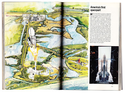
For my birthday last year my very thoughtful wife managed to get me this original copy of  National Geographic from the month I was born. October 1981. Like most people in my line of work, I love National Geographic for many reasons including the very high standard of information graphics and cartography. So, naturally, I got stuck in to see what their graphics were like back then. So here are some examples. I included some illustration too which all seemed to tie together with the graphics to create a uniform style.


The cover story also turned out to be very interesting. It covered STS-1, the first orbital flight of NASA's Space Shuttle program and also the future of the Space Station. That was also a coincidence and quite special to me as last year, and almost exactly 30 years later, I was working on one of my first major graphics for the SCMP. The final Space Shuttle mission drawing the entire program to a close. Shown in an earlier post.


Nice illustration


Graphic showing main parts and basic maneuvers


The planned Space station. Long before ISS


Kennedy Space Centre


The two illustrations above also serve as an infographic with numbered pointers explaining what the various parts are.


Next up, a few maps. The cartography was still of a very high standard 30 years ago. From three page fold outs to single column locator maps.


Fold out map of US and USSR naval presence in the Indian Ocean


Mono lake in California.


Single column migration route map


Everest's Northern Ridge


And finally another hand drawn graphic about restoration of a Roman facade.


That's it... Hope you enjoyed them.